Creative Direction / Art Direction / Design
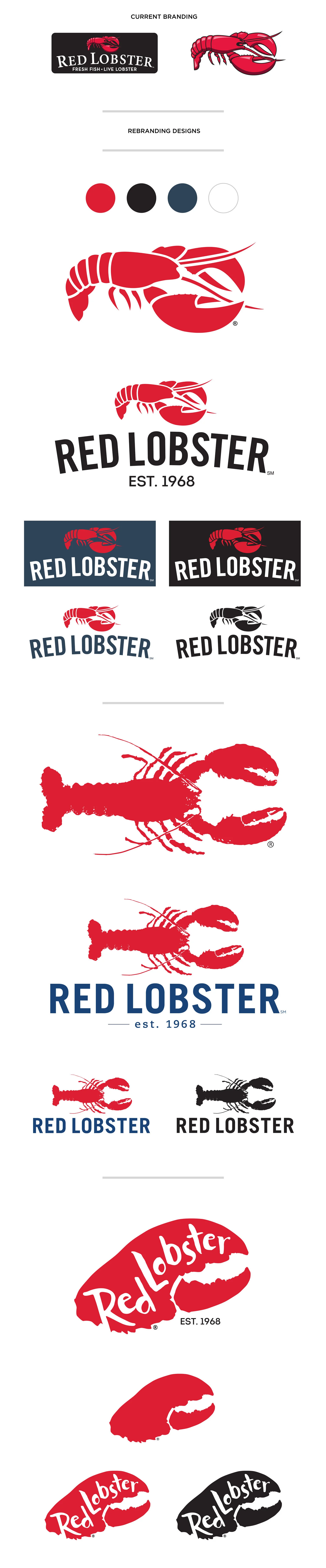
OVERVIEW: The Red Lobster rebranding initiative was developed to modernize the brand while preserving the equity that made it instantly recognizable. The objective was to strengthen brand perception by communicating freshness, quality, and seafood expertise through a more contemporary visual identity.
The concepts introduced a more natural, organic design language while exploring blue as a complementary brand color to evoke the sea and reinforce a fresh, modern feel.
A key consideration throughout the process was the evolution of the iconic Red Lobster "critter." Rather than replacing this highly recognizable mark, each concept reimagined it as a cleaner, more distinctive mark while maintaining a connection to the brand's heritage.
Concept 1
Leverages the existing equity of the critter by simplifying its form, refining key details, and improving scalability. A contemporary typeface and subtle upward arc create a cleaner, more energetic identity while preserving familiarity.
Concept 2
Features a more illustrative, top-down critter with organic textures that reflect the variety and authenticity of Red Lobster's seafood offerings. A modern sans-serif wordmark balances the expressive illustration.
Concept 3
Focuses on a bold, simplified claw icon paired with an integrated wordmark to create a distinctive and contemporary visual identity.
All three concepts introduced the tagline "EST. 1968" to celebrate the brand's heritage while replacing the existing tagline, "FRESH FISH. LIVE LOBSTER.", which no longer reflected the breadth of the menu.
The rebrand was ultimately paused during development as business priorities shifted.